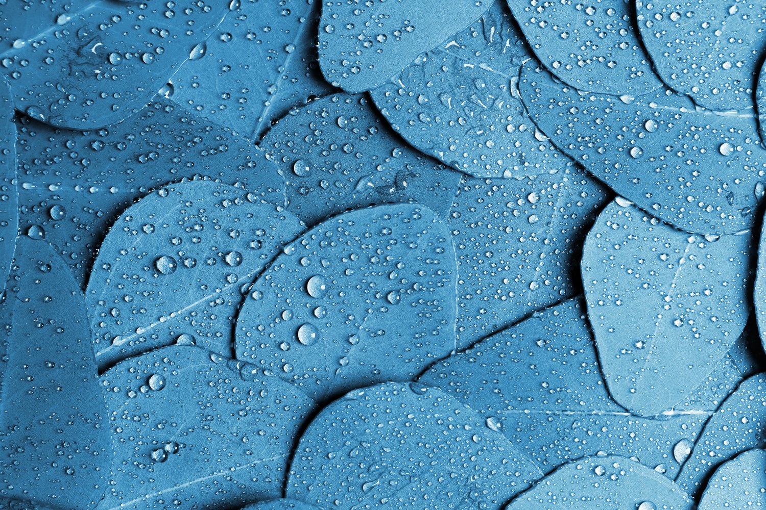
Blue is present in many countries' flags, dominates in the corporate identity, and is the same great choice for both your business attire and your favorite pair of jeans. The clean and pure association with the colors of water and sky also means it is often used by healthcare brands. And because it is the color of business but also likable and inspiring, it is preferred by many social media companies.
Blue has a more complex meaning than any other color. Our article will highlight the most common usage options and how to get the maximum benefits if you decide to choose visuals in blue color for your current projects.
Blue in interior design
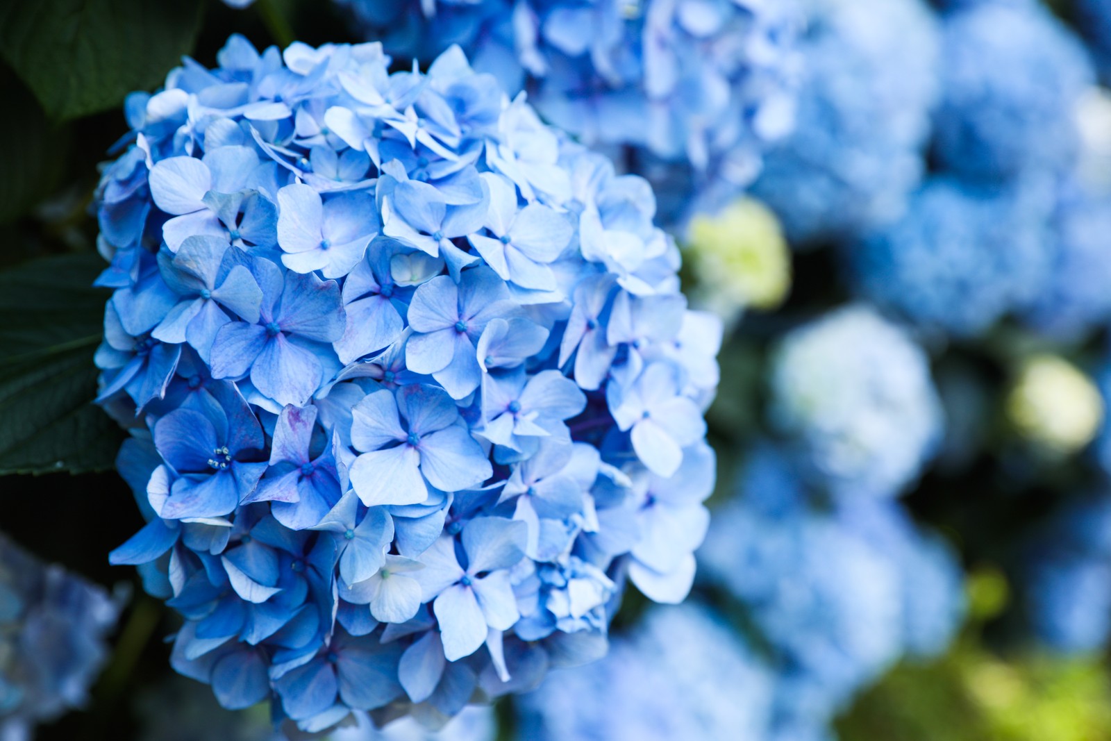
The blue color usually brings a sense of space and additional light to the interiors. Properly selected shade visually separates surfaces and creates a sense of depth. It works best for rooms with natural light. Blue goes well with natural colors such as brown, beige, green, and gray but makes unique combinations with wood, white, and yellow.
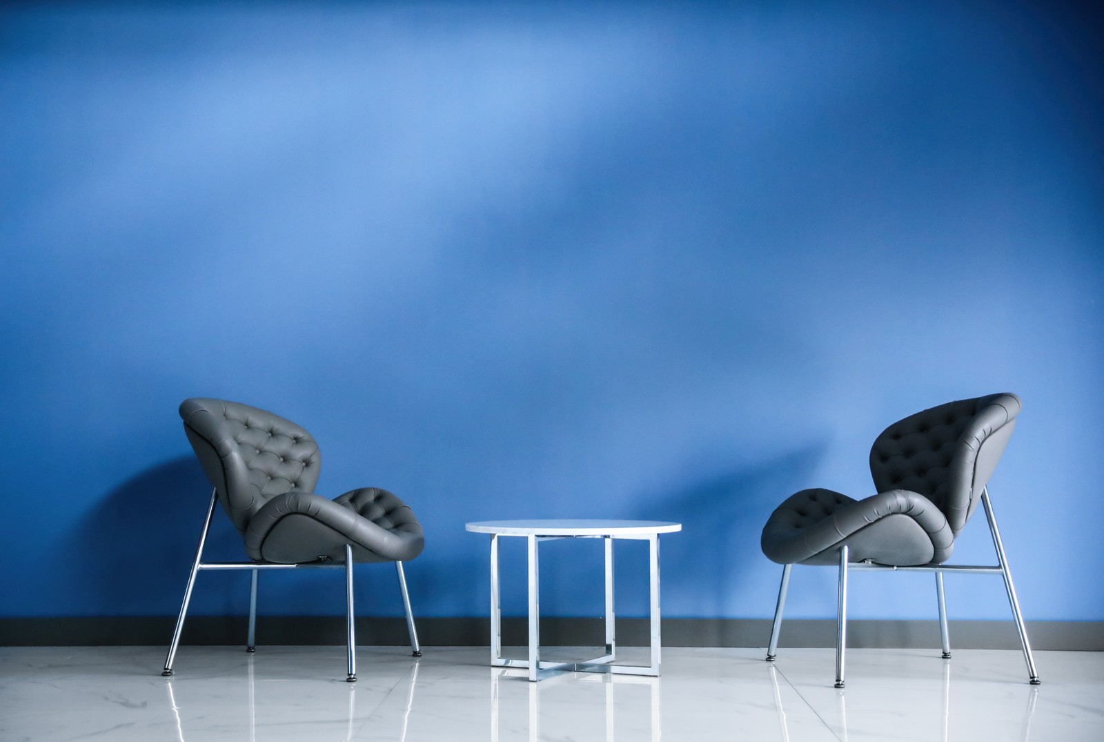
The blue color is practically created for rooms intended for relaxation, so the most common choice will be to use it in the bedroom design. It will help a person fall asleep more quickly and reduce their stress levels after a working day.
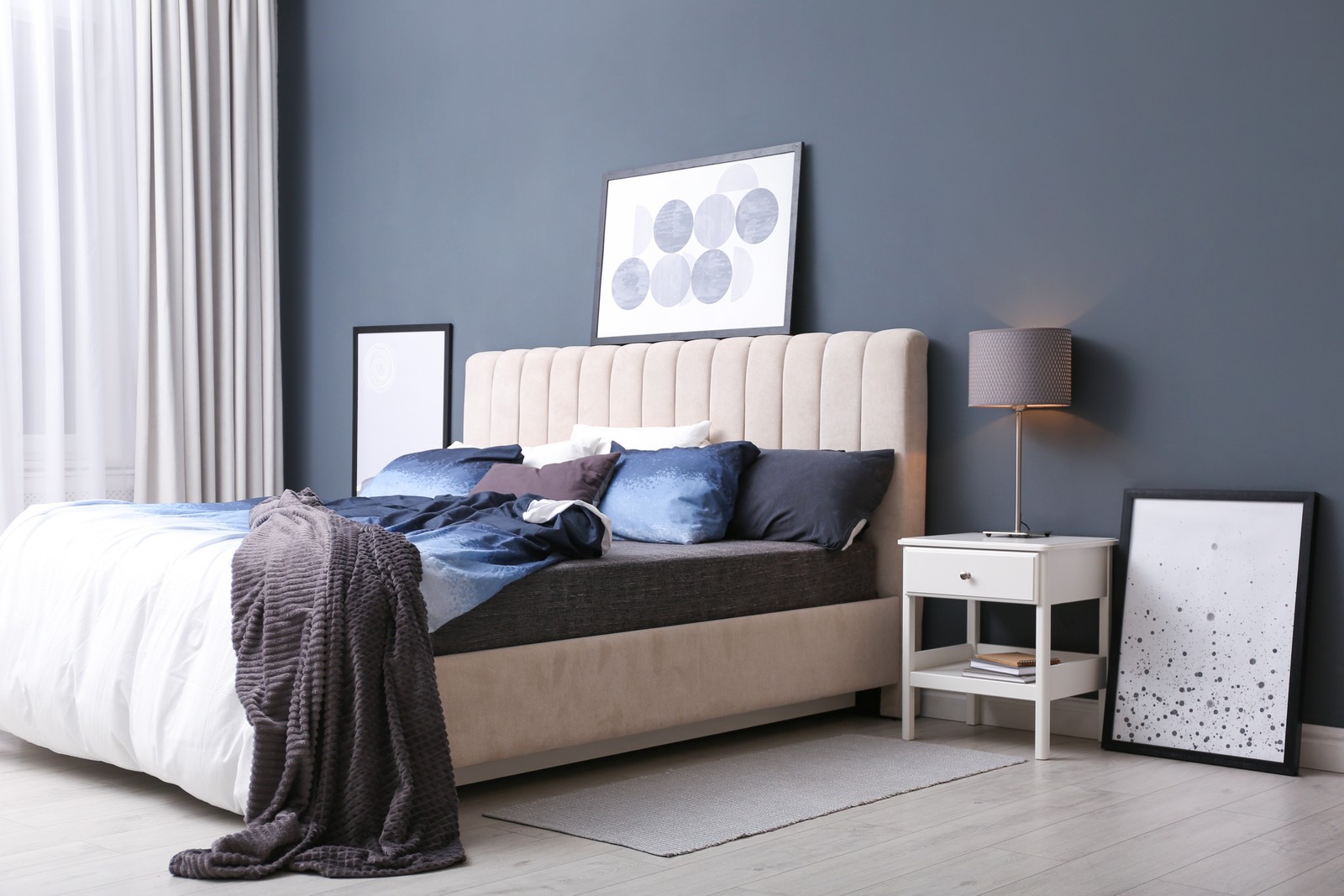
If you want your bathroom to have a blue palette, try minimalism or hi-tech style and combine your choice of blue color with white. For example, make blue walls, floor, or ceiling, so snow-white bathroom ware, in this case, will serve as a white accent. If you are more into art-deco, then yellow, green, and purple will be the best match.
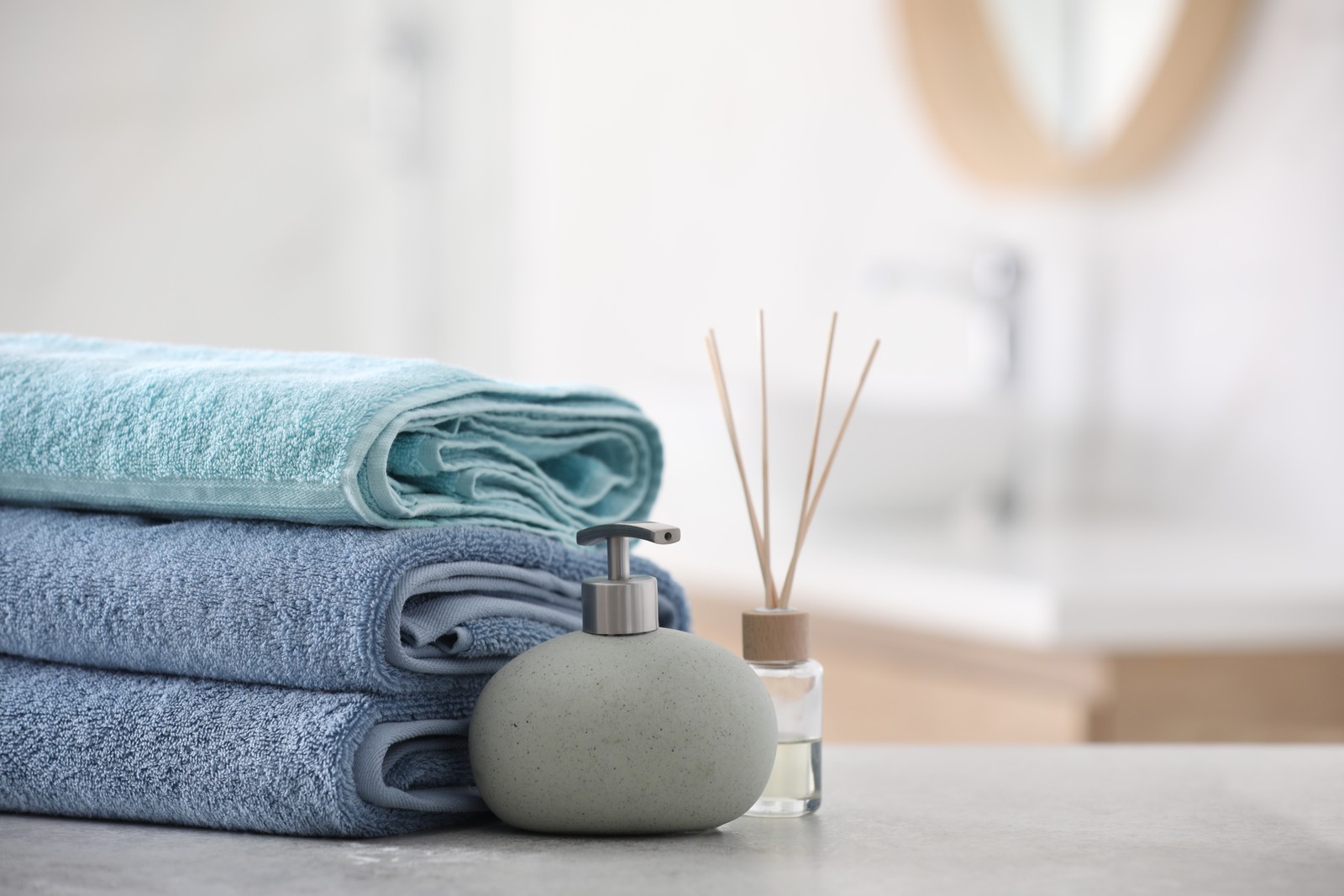
You may also incorporate blue shades into a living room design. The options to consider are blue, aquamarine, turquoise, ultramarine, or indigo. Because they are all associated with space and light, it will not be surprising that people feel more relaxed and feel the lightness of being. If you prefer to add blue to your kitchen, both bright contrast colors and monochrome combinations will be a great choice.
Remember, it is not necessary to make everything monotonous blue, but to use it in moderation. For example, add blue accents in accessories, furniture, and textiles, or, for the most prominent alternative, paint the accent wall. A large amount of blue, though, can look heavy and dull when not diluted with contrasting colors. So get inspired when checking our Interiors category, which includes the most updated solutions for all the rooms in your house.
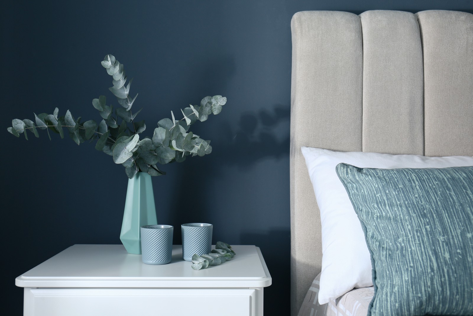
Blue in website design
Colors in web design evoke certain feelings in the resource visitors, as each shade is psychologically connected to human emotions. Therefore, different tones may change the perception of the site for the better and vice versa. That's why an essential task of the resource owner is to choose the right set of shades so it creates a positive subconscious impression.

Usually, people decide to buy or explore a website within the first couple of minutes of the first interaction. And it is the website design and colors that influence the decision to cooperate. Since people perceive pictures differently, and your task is to interest all of your public, consider the photos in blue hues. Blue is the most popular, neutral, and universal color for a website, and can be used either as a main theme or as a background. This way, it will help increase loyalty and win trust, calm down, and add confidence and a sense of reliability.
How do you know the exact shade of blue to have the right impact on your audience? First, note that light blues are often relaxed and calming, while bright blues can be energizing and refreshing. Second, dark blues, like navy ones, are excellent for corporate sites or designs where strength and reliability are important. And lastly, deep blue is a symbol of luxury, so you can use it to design relevant resources. Please also check our Blue collection in the Colors category, which may give you ideas and provide high-quality photo content for your web projects.
Blue in the food industry
In the food industry, the right color is money. Food manufacturers scan food with colorimeters to achieve mathematically calibrated hues. Many parameters evaluate color at all stages of the food chain, so companies ensure the color of choice is bright or appealing enough for the end user to buy a particular food or drink.
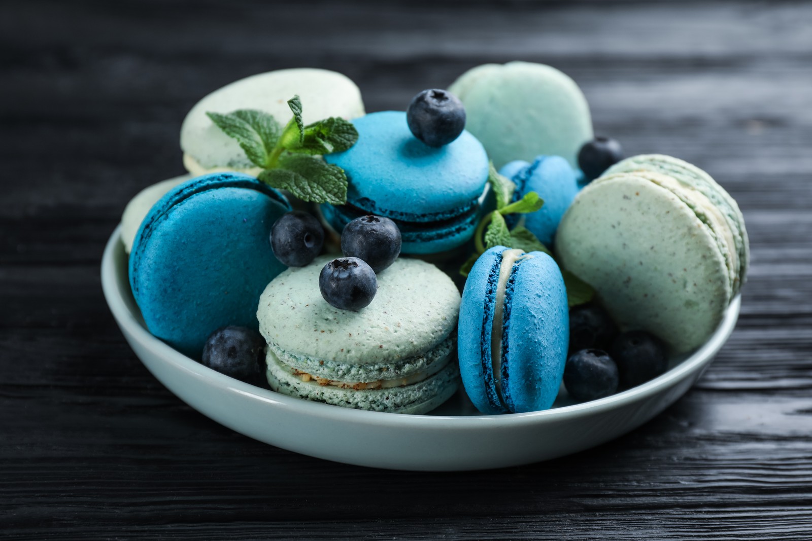
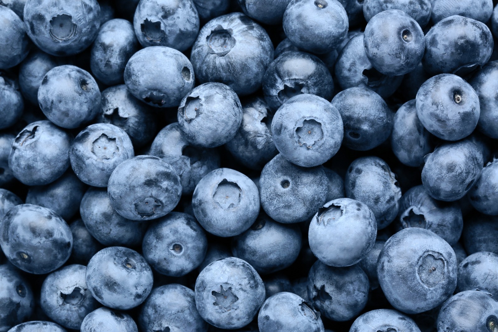
Blue, as we know, has few connections to taste or smell as the color is rare in nature. Yet, there are some foods that are colored blue naturally, such as grapes, plums, blueberries, etc. Please check our collection of fruits and berries in the Food category.
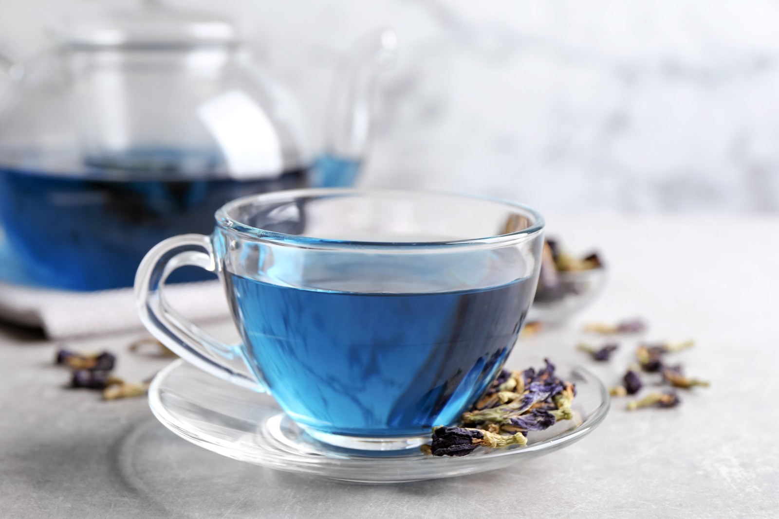
As for the other food and drinks that are artificially colored, people choose them mostly to match a party theme, for example, baby gender reveals or a wedding, but would not select them for daily consumption, as warm-colored foods including red, yellow, green and orange look more appetizing. However, if you run a cooking or lifestyle blog or write articles related to conscious and healthy living, you may download the right pictures on our website.
How we can help you
Africa Images is a website that provides the most trendy, high-quality solutions for all your commercial and non-commercial projects. We know how to make your business stand out. Our team of professionals is working tirelessly to deliver the best images to choose from.
We cover every topic you may need; that's why the number of stock photos is constantly growing. So there is no need to worry about where to get suitable illustrations! You may either go straight to the Blue collection on our website or use the Search option with the convenient filters to narrow the search. Skip the blues, and get the blue images that perfectly match your article, blog, or business account.
---
Africa Images is a passionate team of professionals. Our goal is to make africaimages.com the best place to buy visual materials taken by Africa Studio for individual, business, and non-commercial projects, including but not limited to informational, educational, cultural, and scientific uses.
