Trees change their foliage to autumn, and the weather becomes colder. We look forward to the warmth and energy that we need the most: getting into cozy sweaters and wrapping into bright scarves, staying by the fireplace, cuddling with a pet, having pumpkin pie, craving for citruses, and maybe adding a splash of color in our interior. Of course, orange is also a color of Halloween!
Orange is the only color from the whole spectrum whose name was taken from the fruit, and it does not have cold shades in its palette. This color is believed to stimulate the appetite, speed up metabolism and body recovery. Even though Buddhist monks wear orange robes that symbolize humility, the same color means business and energy in modern culture. It helps to stay alert and energetic by increasing productivity and encouraging the competitive spirit.
Palette and the best partners
Numerous shades of orange delight us with their depth and saturation. Depending on the dominant primary color, the following shades are distinguished:
- Coral Color. Most people interpret coral as a cheerful color since it is warm, dynamic, and quite vivid. It blends the femininity of pink with the optimism and energy of orange. Coral consists of three shades - orange, pink, and red-which is why it feels friendly, open, and inclusive, and revitalizing. As a warm color, it's best when paired with tiffany blue or teal.
- Amber Color. Energetic by nature, it is warm and vibrant. Color promotes happiness and inspires confidence. In color psychology, amber is thought to symbolize vitality, boldness, and safety. Due to its intensity, the color must be used carefully as an accent and should be paired with deep browns and reds for an earthy palette and deep greens for an autumn-inspired style. Amber goes the best with royal blue as complementary.
- Peach Color. Most of all, it feels comforting, bringing up a sense of warmth, joy, and youthfulness. Peach matches best with electric blues and for a bold, dynamic combination, and all shades of pink (as it has pink in its base); however, it also works well with green, brown, and even black.
- Orange Peel. Vibrant color, mostly about excitement, enthusiasm, and warmth. The best combination is with red, brown, and achromatic colors such as black, white, and grey.
- Salmon Color. Often referred to as a lighter shade of Coral. With pink being the driving color behind Salmon, it is considered a color of hope and a signal of health and happiness. Greens and blue-greens are powerful complementary hues to Salmon, bringing out its orange tones. Salmon also works well with white, orange, and pink to create a summary, feminine color palette.
- Burnt Orange. Some people call it terracotta or even amber, and it's popular due to its warm hue. Not quite as loud as tangerine or neutral like tan, burnt orange is the happy-medium color that matches dark blues and grays. You may also combine it with mint green and peach for a livelier palette. Of course, black and white is a classic combo, too.
- Champagne Color. It is named after the bubbly drink and represents sophistication, comfort, and excitement. It goes well with white and pastel hues. For more contrast in brightness, there are good color combos with medium and light brown, blue, and purple shades.
- Carrot Orange. It results from a mixture of bright yellow and glowing red, conveys energy well, perfect for accessories. It goes the best with neutral shades of beige or nude.
- Classic Orange Color. Orange has more balanced energy than red, not as passionate and aggressive, but full of vitality. This color is also a color of safety. Pairs well with blue, brown, burgundy, white, purple, and mimosa yellow.
- Dark Orange Color. Otherwise called ginger, it is associated with success and presentability. Muted and darkened tones are associated with spices, which adds respectability to the image. It looks good when matched with white or black, but it's a winning combination when matched with grey.
Orange in psychology
People who love this color understand their own aspirations and desires, and they tend to see positivity around and have the strength to work hard and efficiently. Many creative people among them may come up with unusual and unique ideas, readily taking on new projects and achieving success. In addition, they are sociable, love to spend time with friends, and are always in the spotlight, creating a good mood for those around them.
Did you know that orange shades are actively used in psychotherapy and help to cope with depression, as they carry the character of happiness and joy? Furthermore, use a combination of meditation and art therapy. You will be able to get rid of excessive shyness and fear of communication since orange promotes self-confidence, stimulates a success-oriented mindset, and unleashes creativity.
When you feel apathetic or overworked, this is a great way to recharge your batteries and fight off a bad condition. Hence, orange, in conjunction with music, is used in therapy for those who have experienced severe shocks, for example, the loss of a loved one, as it is proven to be helpful.
If someone avoids this color palette, then this fact indicates this person is phlegmatic. Such people prioritize order and set rules for everything, and spontaneity is not what describes them. Also, people who tend to avoid the orange color may not have any issue with it; they just do not want to stand out and get unnecessary attention. They will not like not only orange but all bright colors, too.
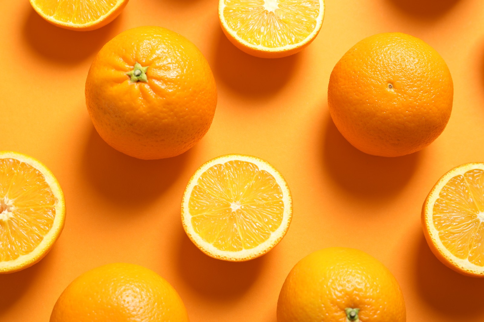
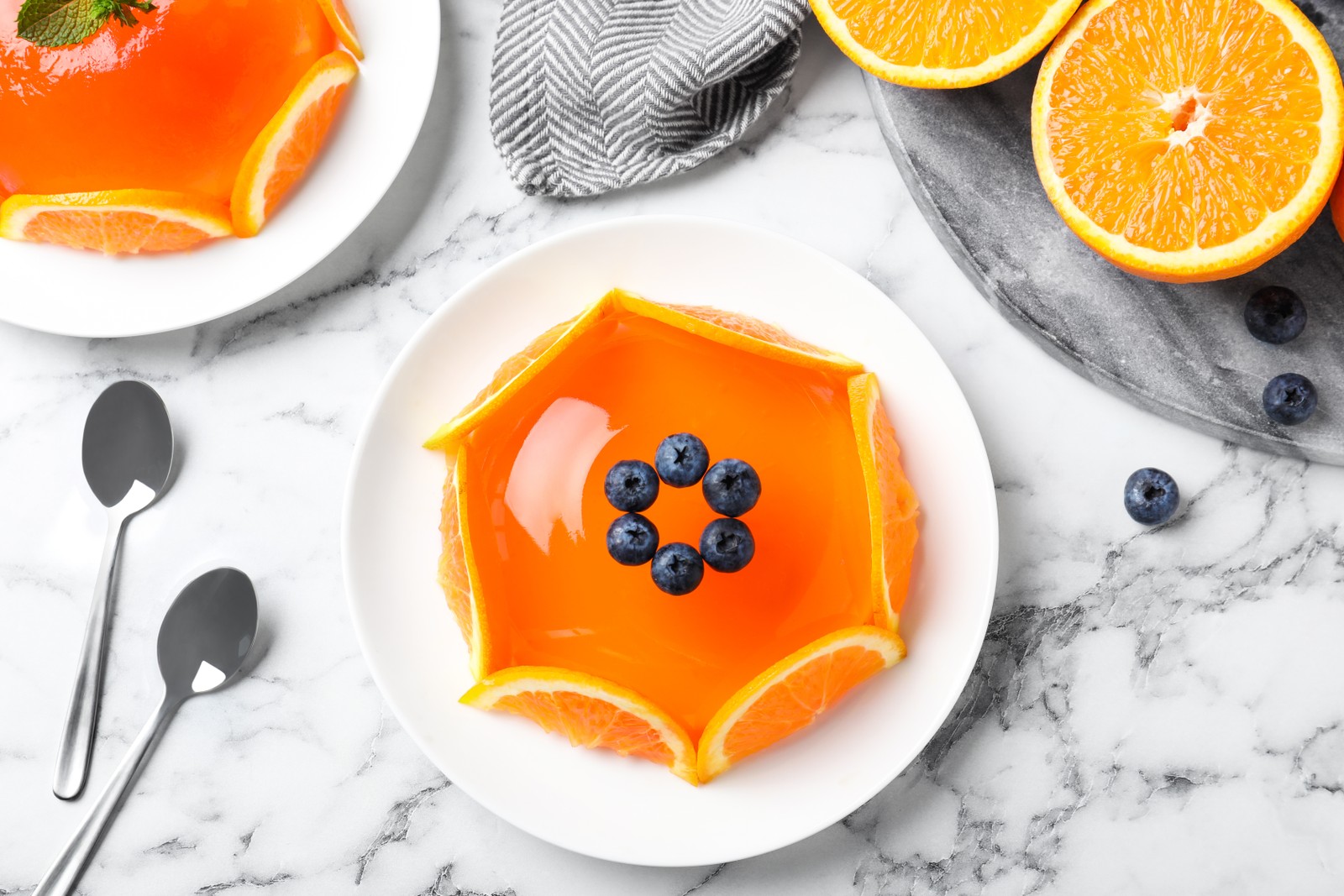
Orange in food
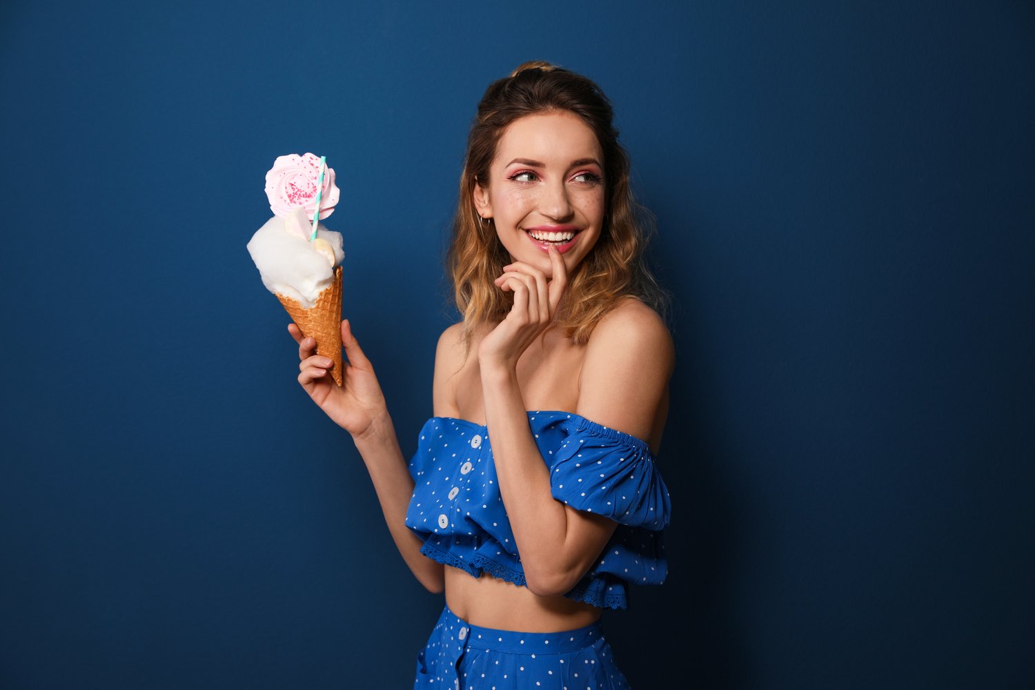
Food of orange color, such as oranges, tangerines, sea buckthorn berries, pumpkin, carrots, etc., has a therapeutic effect on the body. Look at our collection of stock images for more examples. At this point, are you not craving some orange food? It strengthens the nervous system, improves blood circulation, and activates the digestive processes. Since orange is the color of joy, it helps to get rid of the accumulated negativity. Orange food adds optimism to people and improves their social skills.
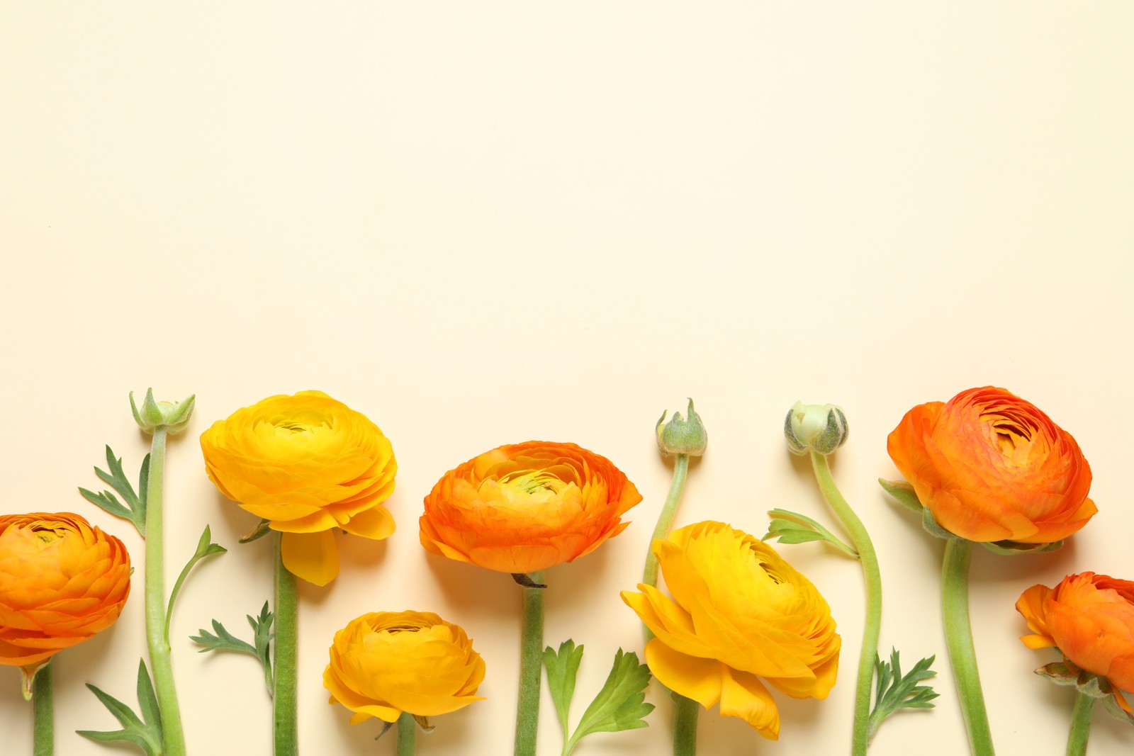
Orange in floristry
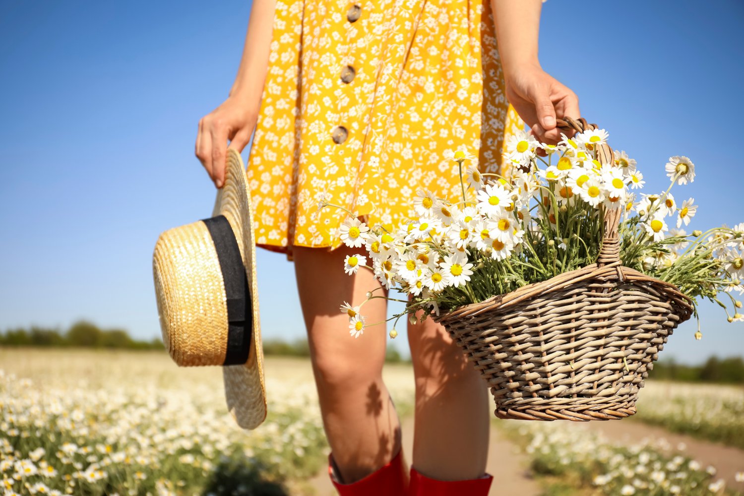
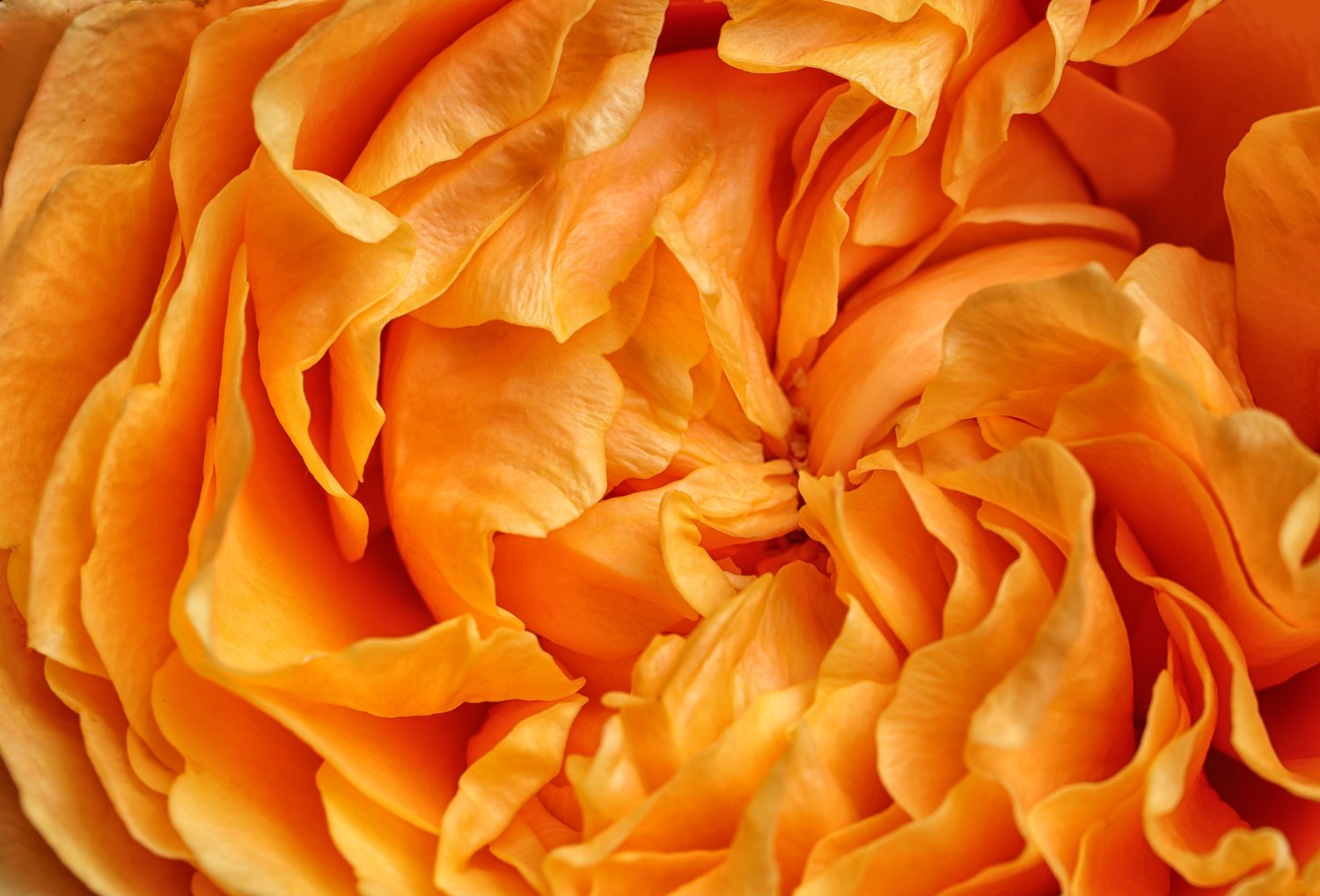
Almost all flowers have several shades of orange in their variety: roses, gerberas, carnations, tulips, and chrysanthemums. Take a look at our Orange collection of stock images. In floristry, orange is associated with joy, warmth, and wealth. If you wish good health, well-being, and success in all endeavors for someone, or to express your respect, giving a bouquet in orange tones is a great idea. Since this shade does not carry any romantic connotation, it is recommended to give orange flowers to friends, teachers, officials. Also, a bouquet in orange shades will be an excellent gift for a creative person.
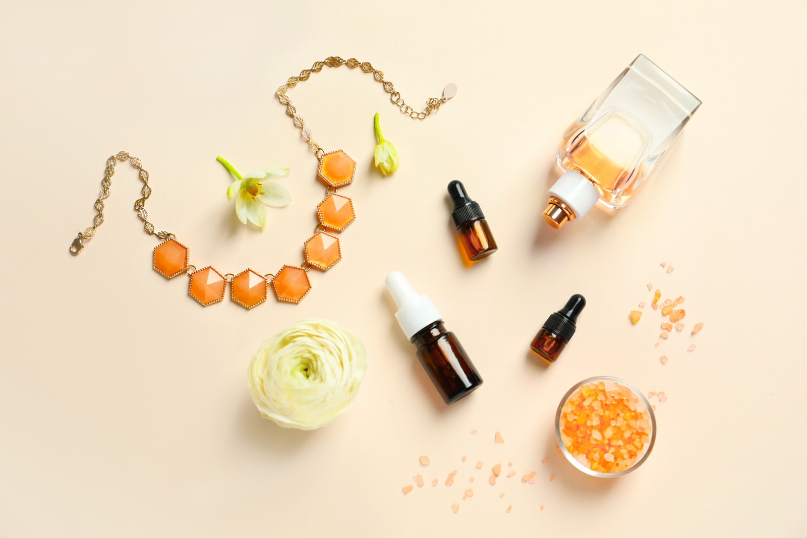
Orange in fashion
Orange has become quite popular nowadays. It reminds of red in the composition, which attracts the eyes of others, and testifies to the courage and positive attitude of its owner. Even if you add accessories in this color, it will attract enough attention.
Although orange is quite capricious in combination and styling, there are a few winning combinations, for example, classics, such as combining orange with black or white. You will look spectacular and show off your good taste if you complete the little black dress with an orange jacket or add accessories in the form of a scarf, handbag, or belt. A bright color turtleneck or pullover can be combined with straight black trousers or a pencil skirt. Feel free to try and mix the other styles for bright accents in your look to achieve a fresh and appealing effect with a twist.
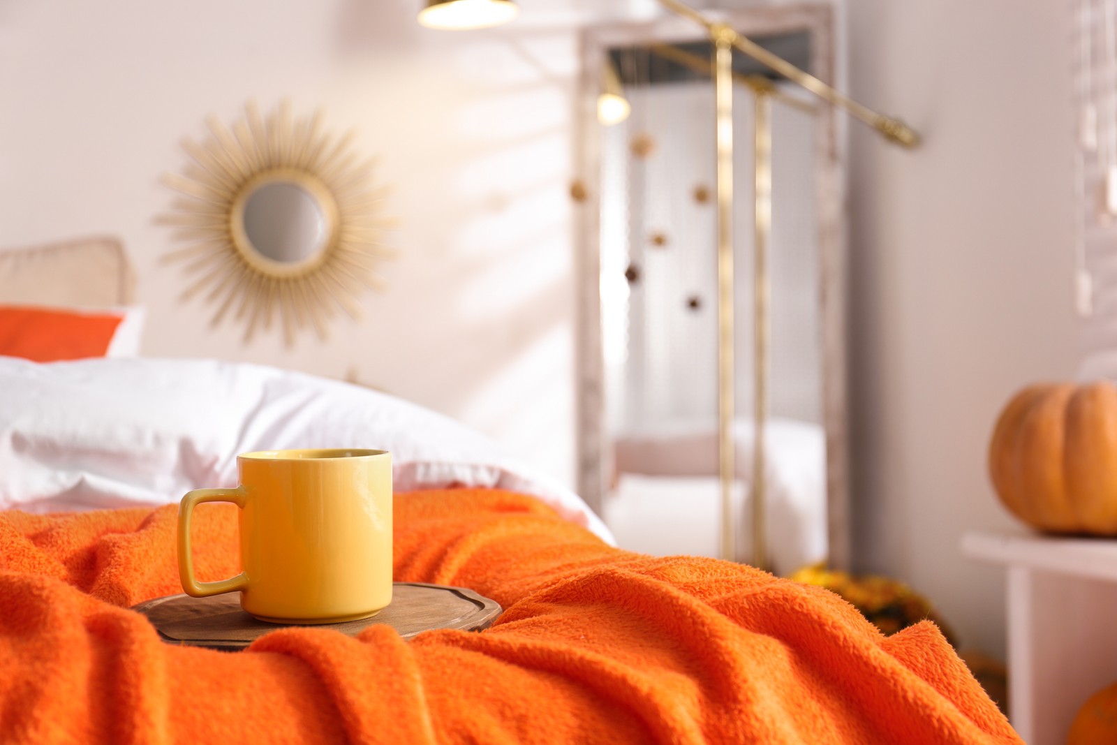
Orange in design and interior
Have you ever noticed how orange objects in the room immediately catch your attention?
Orange is a very vibrant color, and when used in the interior, it should be added with caution for accentuation purposes only. You may apply orange for textiles and accessories rather than painting walls or furniture. By adding orange accents, you may achieve making the room more cheerful, warmer, and active.
Remember to be careful when using orange shades, as this color tends to displace all other colors. Its amount will determine how much the color of objects of a different color will be noticeable. The design rule states that orange will be good in the kitchen, dining room, nursery, office, or home study room. If you need to design the space for rest or relaxation, skip this color or choose subtle shades.
Orange is one of the appropriate colors for correcting room imperfections. If the windows face the north side and the room looks dark, adding a splash of orange will compensate for the lack of sun and create a joyful mood. However, if the windows are facing south, it is not recommended to use orange at all, as it may make the room feel stuffy and airless. If the space is small, better avoid using orange decor because it visually brings objects closer; however, if you pick lighter shades such as peach, you may use it even for walls. Feel free to look at our royalty-free photos to get ideas and tips on how you may add a splash of color to your space.
It is not easy to find a good combination with orange as it does not have cold shades. Since it is very warm, it should be better combined with warm hues. You may take note of the few combinations that always do the magic, as described below:
- Orange + grey equalizes the design and makes it look neat and stylish. If you combine orange + black + white, you may create an unusual interior with a twist.
- Orange + blue will look fresh in your vacation home. Choose turquoise to match with carrot orange or navy blue with terracotta and see how refreshing it is.
- Orange + yellow is a perfect duo for those who prefer bright and luscious designs. You may try to design a nursery or kids' room in these shades or try your luck with a living room!
- Orange + beige is a win-win combination: while orange brings inspiration, the beige color makes the place cozy. Looks best in big spaces.
- Orange + pastel looks balanced with neutral hues and most pastel tones. Pastel muffles the excessive saturation of orange. An excellent example of such a duo is orange with pastel mint or delicate cream color that looks amazing in the living room or even in a kitchen.
The orange color will add comfort and warmth to any interior, that is much needed with the arrival of autumn. If you do not know where to start, change with accessories: add a pair of brightly colored pillows and a throw blanket. We are sure you will not be disappointed!
---
Africa Images is a passionate team of professionals. Our goal is to make africaimages.com the best place to buy visual materials taken by Africa Studio for individual, business, and non-commercial projects, including but not limited to informational, educational, cultural, and scientific uses.